Leaderboard

Popular Content
Showing content with the highest reputation on 07/25/2018 in Posts
-
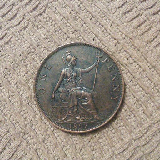
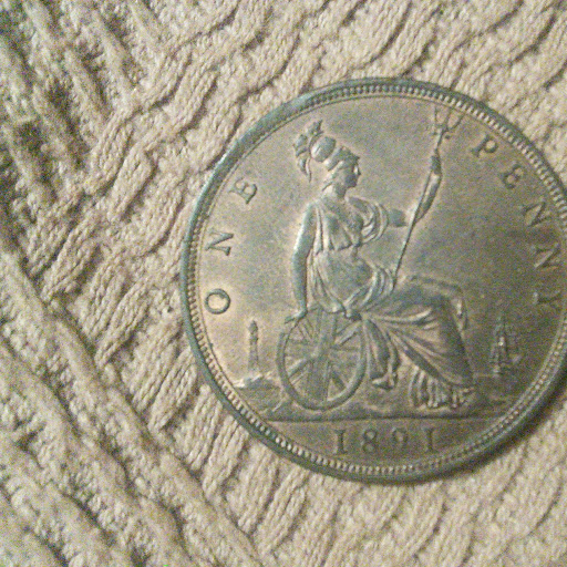
Now got an 1897 O .N E penny (F147) courtesy of Bob @RLC35 I'd estimate at EF. Nice coin and another Freeman currency type box ticked.
 6 points
 -
The coin below is the most extreme example of this type that I have managed to find, It has a doubled line at the bottom of the O in ONE, and this is the aspect that is most evident on all the examples that I have so far come across, but this particular coin also shows a partly doubled line at the top of the O. The design of O in this font type is slightly elongated from top to bottom, with fatter slightly less curved sides than are to be found at the top and bottom of the O. Its clear that the inner extra line at the bottom is straighter than the curvy bottom of the O itself , and this suggests to me that the inner line is the side of a 90 deg. rotated O showing below the over stamped correctly positioned O, its not a rare variety as I have found it on Rev. Freeman J pennies from 1875 to 1880, though It does seem a little scarcer on the 1878s than the other years, but you can only find it on Royal Mint coins, and not at all on Heaton Js. Its missing on the 1876, as this is a Heaton only year, and I haven't found any so far on the 1881s that I have looked at ??. As its found covering so many years, and indeed even can be found on proofs, it suggests that it was present on one of the master dies, with many working dies being made from it all carrying the same error. Your thoughts .

 2 points
 -
Of course, die wear can manifest in all manner of different ways. For example, note the way the 9 on this 1891 penny tends to lack a tail and runs into nothing. That's pure die wear:-
 2 points
 -
1794 guinea, EF or possibly a bit better. Looks nicer in hand without the flash.
 2 points
 -
I totally agree with you. It is often far less than confrontation it is healthy difference of opinion. I am novice in so many ways and like you have mental health issue now I would not give up though it has skilled me in so many ways and helped me come through some of the darkest mental health issues post chemo I think it is a perfect hobby all considering your situation allowing concentration and attention to detail which provides a beautiful calmness even in the darkest moments. They are as I often get told off for saying "just shiny bits of metal stamped with pretty pictograms " but they have the capacity to allow us to reach into history and in doing that they hold an almost magical property.2 points
-
I would have a think first and would send it back if its not right there is know confrontation if you bought it from a dealer .Your collecting interest may change in the future and might then have to take a loss ,should you sell it. There are plenty coins to choose from ,unless its a scarce one and better to have ones your happy with. If you are happy though it doesnt matter what anyone else thinks2 points
-
I agree Peck, that coin is AEF. There is too much remaining detail for it not to be. Distinguishing between die wear and actual wear on a coin surface is an art form in itself. By the way, go on, be a legend2 points
-
Could I be so cheeky to ask you if you would be willing to post a thread in the beginners section on these "proclamation Coins" I would be very interested to learn a little about the topic and as you are doing a lot of reading. I would much rather get the viewpoint of someone starting out than have to read through reams and reams of paper. I am sure most of the accomplished members know a great deal but I have to admit I know "nada", apart from the fact that there was a change in the the Georgy Bluebloods (and yes I know it was porphyria which is purple not blue ) portrait, I had not even recognised this proclamation coinage title. I am not sure if you like writing? if you don't then don't bother , but it is useful to teach others I find, to help make sense of things myself. For example there is this other date of 1827, 1927 commemoratives which I thought were the historic dates with respect to Australia; hence the need to hurry and get the 1827 penny loaded and the destruction in the shipment. I like GIII but I could do with a 101 in proclamation. If you do, don't worry about making mistakes we all do and usually are advised by gentle souls LOL and errors are part of learning. Much appreciate that you have already raised the topic in your own way already. best wishes Larry1 point
-
I'll channel my inner Basil and imagine that I'm dealing with the seller of the "Fawlty" coin in this manner:1 point
-
Keep smiling and remember they are only coins Removed the Quote for Madness ....if it seems a bit random1 point
-
If you are happy with that then that is a resolution. I would however write to the seller if it was on e bay and say without expectation of a result (non confrontational) a summary of the thoughts of us all. You might at the very least get a partial refund I would think if mounted it is worth around £280 - 250. Confrontation is hard I would feel it more if the person was an independent seller if the purchase was from a dealer I would have not the slightest hesitation of telling them directly. If the mount is there or was for your £140 refund you could buy yourself a lot of books and other coins. In my experience most dealers know full well that a clasp has been removed, the tell tale sign is the reeding around the edge which is often missing or you can tell it has been redone with a tool. It is a sad reflection of things that I am afraid confrontation seems to be a large part of this strange new hobby you have decided upon, perhaps see it as a skill development, assertion of fact is not confrontation merely a direct statement of the circumstances. If you can prove the clasp removal with good pictures you should open a return case in my opinion E BAY are excellent at forcing a statement by the seller even if it takes the full period of resolution 30 days you will get all your money back and he /she will have to pay the return costs. With £420 you could achieve a lot .1 point
-
In a sense, yes. For example certain coins in certain years are known to have die wear problem. I'll just take the 1906 penny as a prime example. The reverse of the 1906 has a reputation for die wear, and mine is no exception. It's otherwise EF with some residual lustre, but the reverse only looks fine in places, especially parts of Britannia. This is in addition to what Peck says above, which I totally agree with. Take a look:-
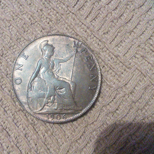
 1 point
 -
You have already been a "Forum God" for so many years. "Forum Legend" is already a downgrade.1 point
-
1 point
-
I had a short break in the Netherlands and been to The Hague on a day trip. The entries for the "World Sand Sculpting Championship" were on open display. Winner of the World Championship 2018!
-Copy.JPG.d0812a37bff4f28cddd40514b26b8545.JPG)
-Copy.JPG.807937bdc64b86ae268f0ef750ba564e.JPG) 1 point
1 point


-Copy.JPG.804e9f6716c1a1a87f9063a5f9c0d8e7.JPG)
-Copy.JPG.e767a5dbd5b7341c501a8ae0170d1abb.JPG)