Leaderboard


Popular Content
Showing content with the highest reputation on 03/07/2019 in Posts
-
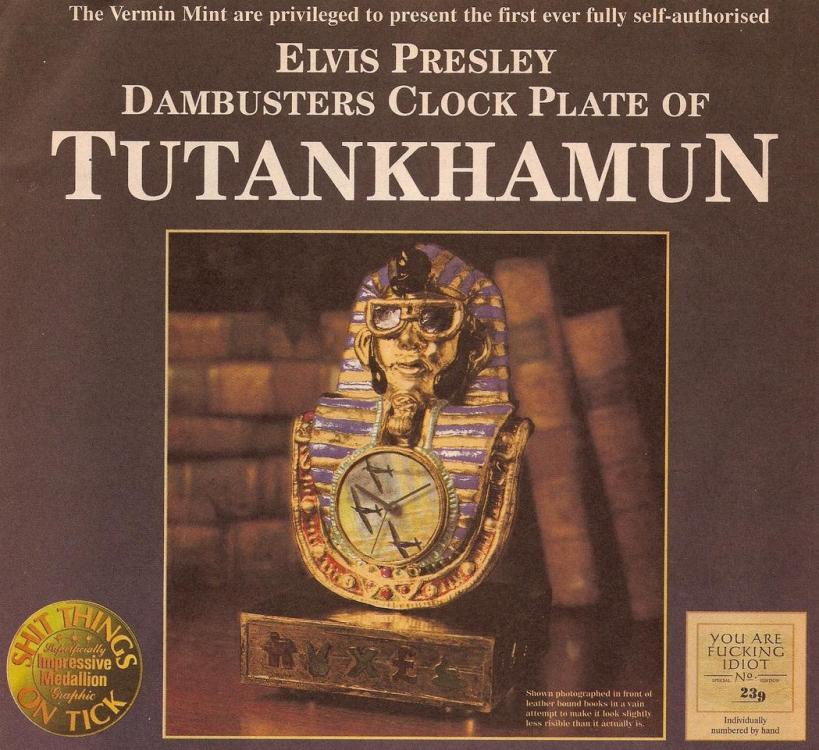
Pardon the language, but this Viz advert sums it all up.
 5 points
 -
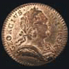
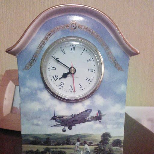
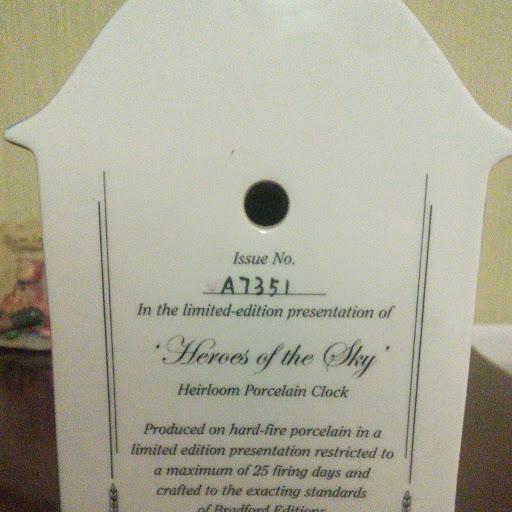
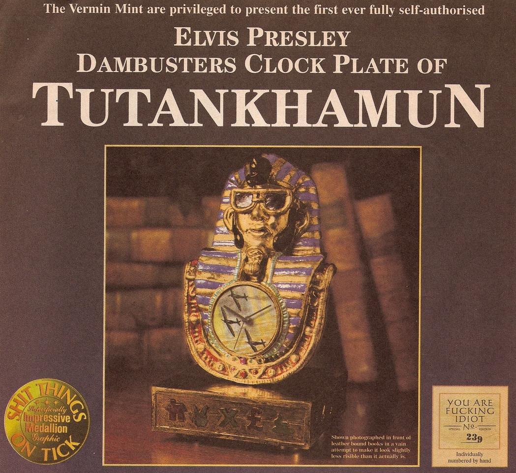
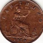
I must be (expletive) idiot A7351, with this purchase which I made in 2010:-
 3 points
 -
It is my opinion that this thinner appearance comes from the metal displacement when the die was recut. If you imagine you had stamped a letter into plasticine and then stamped another letter over the top slightly misaligned, the underlying letter would become thinner due to the movement of the plasticine under the pressure of the new stamp. It seems to be quite a common effect with recut letters/digits.3 points
-
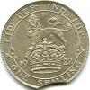
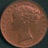
Very pleased with the 1902 LT (lot 1285) I won at the LCA. True, I did pay over the usual odds for it. But well worth it in my view, as it's about as close to flawless as it's possible to get for a currency strike of that age.

 3 points
 -
2 points
-
2 points
-
Should have kept it - it will soon be worth more!2 points
-
Too easily confused with Olympic boccia?1 point
-
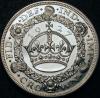
CGS photos of my crown where the hairline is not visible.

 1 point
 -
Yes, that's a shame. And there is also the ding above eye and mark on the nose. My type example has a hairline too which is much more obvious in the photo than in real life. Interestingly, the second one in the date is missing the bottom right serif in both mine and the colin cooke coin.
-Copy.thumb.jpg.4931990abc70d69b4758cb8f9684f4b8.jpg)
-Copy.thumb.jpg.624c65bd278c71a06a3fa5a2f9a0d731.jpg) 1 point
1 point -
It is sooooo refreshing to be away from all the corporate nonsense.....😁1 point
-
One of those topics is a doddle compared to the other. . . No, we're NEVER going to agree about slabbing.. . Good luck with your new venture Colin, and welcome back.1 point
-
Welcome back Colin. I had 10 years consulting with Mowlem before they "merged" with Carillion. I hope you are going to active with farthings again. All the best in your new venture...Peter1 point
-
Hello again Colin. Hope the new business is doing well.1 point
-
i didnt notice that till you pointed it out, now its all i can see lol1 point
-
most certainly fake, 100 per cent1 point
-
I can't pretend to be an expert on coin minting, and certainly not on letter/numeral repairs - which is where the 8 over 6 and 6 over 8 are touted to originate from. But I'd imagine that it might have to do with the attempted removal of the incorrectly punched number, prior to the correct number being stamped.1 point
-
Well I suppose best described as a thinner line than might be expected - hence wiry. Never heard the expression before though, not as it relates to a coins overdate any rate. In a paradoxical sort of way, I'm actually quite pleased I bought it. It will go nicely in the oddments drawer and could prove a talking point in the future.1 point
-
In the Coin Yearbook 2019 there is quite a good article about the decimalisation, a critique of the process which obviously is easier with benefit of hindsight. Don't have it to hand right now but I believe the article is of the opinion that having shillings & florins still around in 1990s was just a bit silly, and that the weight-to-value concept of coins should have been scrapped in 1971, allowing smaller & cheaper 5ps & 10ps from the off and therefore no use for 1s and 2s. Also would have meant the decimal halfpence could not have been so tiddly.1 point
-
1 point
-
If things weren't so serious it would probably be funny.1 point
-
1 point
-
Try hearts. The Hanoverian shield has hearts on it as noted on the 1787 coinage, so would be appropriate for anything commencing with G1.1 point
-
People have been wasting their money on shiny things for centuries. It's not a new thing. I actually think this is more honest than most of the recent Royal Mint junk. It doesn't pretend to be anything it isn't, unlike the mint "coins" that were never intended to be spent, in a multitude of different forms, all designed to deceive the collector as to their investment potential etc etc.1 point
-
Apt use of the middle English there👏🏼 😂1 point
-Copy.jpg.b2367efff4041275bab13fbc40dc6dc8.jpg)
-Copy.jpg.bfb0b47b8838ef872f6cc901c2d6f540.jpg)