Leaderboard


Popular Content
Showing content with the highest reputation on 12/06/2024 in Posts
-
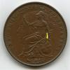
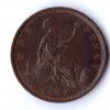
1847 Font Variation I am currently cataloguing an excellent Victoria ‘Young Head’ Penny collection for a colleague, about 150 coins in total. I have reached his 1847’s, and this has reminded me of something which I spotted in my own collection quite a few years ago, although my colleague does not have an example of his own. For the YH penny series Gouby has documented many date variations, particularly in the 1850’s. These include overdates and font types as well as date widths and repaired numerals. He has not, however, currently documented any 1847 date variations. To date I have found that 5 different obverse dies have been used in 1847, with date variations which include repaired 1’s and 4’s. The most interesting date feature, however, is that one of these obverse dies has a different fatter 7 font. This die is paired with the DEF Close Colon reverse, and it is easily identified by the die flaw after the 2nd A of GRATIA. Having checked past results at London Coin auctions I can see that, out of the 13 images of 1847 DEF Close Colons, there has been one other coin like this, sold by them in June 2018. A single example from 13 makes this quite a rare variety. Both my own piece and the one at LCA are high grade, so I am confident that the fatter numeral 7 is not due to ‘flattening’ through wear. This font can be seen below, alongside the normal 7 used in 1847 , and the LCA piece is also shown below for reference. I hope this is interesting for the Victorian penny collectors.

 2 points
 -
Watched 'Quatermass and the Pit' the other day- fantastic! Interesting dialogue exchange in the middle: Professor Bernard Quatermass : Roney, if we found out the earth was doomed, say, by climatic changes, what would we do about it? Dr.Matthew Roney : Nothing. Just go on squabbling as usual.1 point
-
Sometimes with the crowns of the Edward pennies it’s often easier to look at what’s not there, namely the shapes of the spaces inbetween the fleurs. In this example, looking at the space enclosed by the upper section of the 7 makes it much easier to see. Nice coin!1 point
-
Yes. Always worth a visit. Jerry1 point