|
|
The current range of books. Click the image above to see them on Amazon (printed and Kindle format). More info on coinpublications.com |
|
|
 Coinpublications.com


Rob
-
Content Count
12,596 -
Joined
-
Last visited
-
Days Won
310
Everything posted by Rob
-
Heritage Galleries Auction - 1860 Farthing
Rob replied to cathrine's topic in British Coin Related Discussions & Enquiries
I think they ship by whatever you choose in the US assuming it is insured. Overseas is by courier over $250, this seems to have been introduced after I questioned how you could only track a parcel once it had arrived in the UK as offered by the USPS - following the 7 month world tour of a couple of lots which I hadn't received. -
1699 halfpenny no bar in A
Rob replied to TerryT's topic in British Coin Related Discussions & Enquiries
I certainly know about it, though whether it is documented in any reference book is another matter. Just about every conceivable combination of unbarred A, stops, overstruck letters, dates etc exists somewhere. Spink lists about 40 William III halfpennies for the three types, but my own list has at least 100 varieties. Sorry, just realised that is a P676. Stop before date only and is also listed in Spink. -
1699 halfpenny no bar in A
Rob replied to TerryT's topic in British Coin Related Discussions & Enquiries
These dots are the centre points to help with engraving the dies. -
Test for Pictures
Rob replied to VickySilver's topic in British Coin Related Discussions & Enquiries
Play around with the contrast on the image and there is a clear H below the date. -
It's a difficult question because at some point you are going to produce an AT coin that looks exactly the same as an NT one. I guess the starting point is what 100, 200, 400 year old silver looks like if untouched, which is that eventually it will go black. An evenly toned coin is far more likely to be accepted as NT than a multi-hued disc, particularly when the latter coin is modern. Random toning in different colours is far more likely to be NT, such as the patchy iridescent colours seen on coins from the 1800s - but even this doesn't exclude the possibility that the colours are due to the residue of a Georgian take-away. This is rarely seen on say 300 year old coins which have had a longer existence and in the main tone down to an even purple tinge with underlying gold highlights. Given that very few coins have a full history of their location over the past century or two, it is ultimately up to the individual to decide. Obviously there is no such thing as 'standard' toning, but there are sufficient examples of all eras to say what a typical coin will look like. There are of course also exceptions - good example of which is a 1731 shilling that I liberated from a broken Georgian drinking vessel base. This was still fully lustred. The situation is slightly different for copper, as it tends to dull consistently with only prooflike specimens showing iridescence, which in turn relies to a large extent on the angle of the incident light. I think most people dislike the fact that someone has deliberately tampered with the surfaces and are naturally suspicious of the motives. You can also get inadvertent toning from the surroundings which although is strictly AT, was not done with intent. A good example being a friend of mine who asked if some coins were worth anything. The box of G5 silver had been carefully laid out with lamb's wool to protect the coins and the entire contents were unc with an olive tone from the wool. AT or NT?
-
Peck - "artificially toned, as issued"?
Rob replied to Coinery's topic in British Coin Related Discussions & Enquiries
Darkened as with the 1944-6 pennies, though Peck doesn't note whether the same agent was used for both series, only mentioning 'hypo' treatment for the later coins. This was a result of the WW2 tin shortage which should not have had any bearing on the currency in 1934-5, so a perusal of the mint records for these years might prove fruitful if anyone has them. -
Heritage Galleries Auction - 1860 Farthing
Rob replied to cathrine's topic in British Coin Related Discussions & Enquiries
Lately? I've spent the last 10 years actively pursuing NGC mis-attributions on the grounds that there are some real bargains to be had if you are awake. -
Dating an old boxes containing 1797 pattern pennies
Rob replied to Cristatus's topic in British Coin Related Discussions & Enquiries
The main problem here is that if it was a privately commissioned box and not a Soho product, then it would be almost impossible to date based on the box design, which presumably would be at the whim of the person having the work done and the location. A combination of early and late Soho pieces suggests a later assembly date than time of issue, unless Peck is wrong with the chronology and these particular types were issued concurrently. What is the contents of this box and how does it compare with other examples? i.e. is there any consistency of contents which would lead you to deduce that the types were issued concurrently? We know that 'Late Soho' is a fairly elastic term covering a prolonged period as the DH11 halfpennies ascribed to it show a degree of recutting, with some Peck numbers showing early strikes only. The silvered P964 for example is early, whereas the P966 brown gilt is later. -
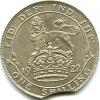
This is a standard FoB crown with the original box. Perfect condition, £10 max though probably less.
-
London Coins Auction - 1851 Halfpenny
Rob replied to cathrine's topic in British Coin Related Discussions & Enquiries
They have always put a notice in when I have pointed something out previously. The serial offender when it comes to not issuing notices is W&W, with a couple of the London salerooms being in between. -
If it's the only one available, or not listed elsewhere, I'll take it irrespective of grade as long as the salient features are clear.
-
Easy to do. You have a nice unc, then later on you see another which appeals so you buy that too. Then spend a ridiculous amount of time comparing the two and deciding which to get rid of before being overcome by indecision.
-
Rare Edward VII penny varieties
Rob replied to Accumulator's topic in British Coin Related Discussions & Enquiries
All of which encapsulates the absurdity of paying such high sums for what is basically a particular die which would otherwise be indistinguishable from the rest, in a defined state of wear. You can make a case for die identification, but I'm struggling making one for a certain period in the die's life. -
Mine sits in a square 2x2 cutout somewhere. I haven't seen it for quite a while. The only 'coin' I own which doesn't fit in a cutout is one of those macabre, iron Lusitania commemorative medals. We must all have one of those somewhere! Not me.
-
I use wooden cocktail sticks to dig them out. Have pierced trays in the cabinet and you don't have a problem.
-
davidrj is your best bet as he collects some French pieces and has the reference books. He generally turns up on the forum in the early hours of the morning.
-
Help with some hammered
Rob replied to Fubar's topic in British Coin Related Discussions & Enquiries
Looks like it is mounted within a ring as seen. -
Can anyone please exlain how such things are created?
Rob replied to RENNES's topic in Beginners area
Detail can be missing as a result of die fill or die damage. Fine relief detail on the die can be blocked with debris from the flan surface, whilst fine die detail can be broken off the die if relatively delicate enough. Six of one, half a dozen of the other and each individual case on its merits. -
The example I used to own cost me 1c + $3.99 P&P on ebay in 2004. Ahhh. Those were the days.
-
Not your type. He deals in hammered, with only a very occasional milled piece.
-
Pictures of any example of an H C halfcrown please if anyone can help. Ta.
-
Morning all. I know this won't apply to the majority, but if anyone has any Charles I coins of Chester, W(orcester), SA(lopia), Hartlebury Castle, 'A' or 'B' mints, 'Garter' or Oxford 1644 coins, please could I have high res images of them. Thanks.
-
Message sent... Yes that's ridiculous, GF/NVF? I think you've rather underestimated it. I'd say minimum VF (the reverse a bit better). But yes, still overgraded. I concur with Peck
-
That's complete and utter bo***cks. Virtually flat or better would be more appropriate. I assume Virtually Flat was deliberate Rob? I couldn't possibly say.
-
That's complete and utter bo***cks. Virtually flat or better would be more appropriate.