
PWA 1967
-
Posts
5,523 -
Joined
-
Last visited
-
Days Won
281
Content Type
Profiles
Forums
Events
Downloads
Store
Gallery
Articles
Everything posted by PWA 1967
-
 Sorry i thought from your original post you were looking at a picture and were asking the question as you DIDNT have the coin in hand. "Would you agree that the attached image has no crossbar" Yes i dont think a V has a crossbar 👍 Some people on the forum know why i look for coins everyday and flip for a profit, but dont feel as if i need to explain myself.
 -
I think you’re better off either buying them or don’t, having the coin in hand rather than asking questions from a photograph. I am sure everyone on the forum who collects copper/bronze from a picture has thought the coin was something it wasn’t. Hope that makes sense, people have looked at bronze pennies for years and although hundreds not recorded it’s because the tiny differences are not really relevant. Cgs when they were slabbing pennies had over 80 just for 1860 and if you want to take it so far then my own opinion is your doing a lot of work finding and buying pennies that nobody else would be interested in. Maybe study the Gouby book as there are plenty in there recorded that you can look for and recorded being more than one of each rather than something struck in error like a random flaw, dot or die crack or tiny difference in date width. As I mentioned you can take it as far as you want, just ones like 1902 pennies there are over 20 and yet most you can’t see with the naked eye 😃
-
Sorry i am a bit thick and perhaps dont understand 😀 Are you asking why a V doesnt have a cross bar ?
-
You can take it as far as you wish, lots of tiny differences, repairs, flaws, die cracks as the coins were struck in there thousands with numerous dies. Its just upto you were you wish to draw a line as if you dont you will end up with dozens all for the same year.
-
Flaws, Die cracks all show mainly from the die if not a flaw to the flan, so will appear to be underlying on the coin. As Jerry says it could definately be a die flaw.
-
Sent you a message.
-
In answer to your first question the best i have seen was Garys on the forum which from memory i think was slabbed GEF with some lustre. Plenty now turned up in low grades but very rare in better than VF.
-
If you turn the coin over you will see the 1 in date is to Gap and for F164 & F164a is to tooth. The obverse although has a few indicators (in the groom book) has a wider Gap between T & O which you can see even if the teeth not there.
-
The Coin pictured is NOT 1*+C.
-
1896 Penny date width
PWA 1967 replied to absence of uniformity's topic in British Coin Related Discussions & Enquiries
I am pretty sure its BP1896Ac 11 Teeth, but yes clearer pictures of the teeth and without the lines The teeth have reasonable gaps between them and the drawn teeth on the picture a distraction. -
1896 Penny date width
PWA 1967 replied to absence of uniformity's topic in British Coin Related Discussions & Enquiries
Its NOT 11-5 Teeth. -
selling......The British Bronze Penny, Gouby first edition.
PWA 1967 replied to RChris's topic in Coin Publications Forum
Will message you now, i go away in the morning at 5-00AM. -
selling......The British Bronze Penny, Gouby first edition.
PWA 1967 replied to RChris's topic in Coin Publications Forum
I dont do these offer things over a few days, but would pay £60 NOW if acceptable for both. No problem if not and dont want them tomorrow Thursday 👍. -
No they are the one not in Gouby he left out as similar to Ab. The one NOT in Gouby is the third one down on Terrys picture.
-
I think its the common one and yes they do look similar and why they are often confused. That i do know as bought a few that have gone straight in the bin.
-
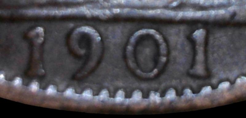
The one i sold which is the same as the book.
-
Does look like one, to be sure would be better without the lines, although you have it in hand and should be easy to tell. A good indicator indicator is a gap between the last 1 and the tooth below. Also your own seems to hang over the right of the tooth rather than above it. These are only tiny differences and why its often confused with the common one. I am more drawn to being the common one Serifs and gap dont look right although would be much better without the last line which is a distraction.
-
Easier just to share a clear picture of the date of the one you have.
-
Correct although in High grade i have only seen Terrys. Looking at your picture and reading your comments, maybe you have just read my post from the one i sold a couple of weeks ago ?
-
Rare in High grade although often confused with BP1901Ab which is the normal one, there is also one not in Gouby as very similar to Ab. Terry is probably the best person to ask as the coin pictured in the book is his.
-
No he didn’t Specialist edition is just 1860-1901. The Binder for sale The British Bronze Penny, you can ask what you want but £40-£50 ish and Richard Bee wanted one recently I think in here.
-
Yes in my opinion 100% correct 👍🤦♂️ On my phone a caught the 🤦♂️picture 😃
-
Sorry to keep repeating myself but yes you can if you know how to do it. You maybe don’t believe me but I use eBay probably a lot more than most people and don’t just make things up 😃👍.
-
It’s very easy to see a buyers maximum bid especially if left an hour or days before the end.
-
The coin was purchased by a friend who I sent the link to he did leave a bid and then a really high one with a few seconds left. He obviously paid what collectors thought it was worth, although he has been asking me for one since a similar one sold in the workman sale and would have been happy to pay more. Maybe what one collector wants others don’t.